History Of Mazda In Australia: A Century in the Making
When you think of Mazda today, you might picture the sleek silver “M” wings badge on the bonnet of a stylish CX-5 or zippy MX-5. But the story of Mazda’s logo is as rich and layered as the company’s journey from a small cork producer to a global automotive pioneer. Here’s how the Mazda badge has evolved over the last 100+ years.
From Cork to Corking Good Cars
Mazda’s origins stretch back to 1920 in Hiroshima, when Jujiro Matsuda took charge of the Toyo Cork Kogyo Company. Initially focused on industrial cork products, the business pivoted toward machinery by 1927. It wasn’t until 1931 that the first Mazda vehicle, the Mazda-Go three-wheeled truck, hit the road.
As the company branched into automotive production, it needed more than just machines, it needed a brand identity.
What’s in a Name? Enter: Mazda
The name “Mazda” first appeared in 1934. It was inspired by Ahura Mazda, the Zoroastrian god of wisdom, harmony and light, fitting for a company that wanted to make an enlightened mark on the world. Coincidentally, it also mirrored the pronunciation of founder Matsuda’s surname, tying the divine with the personal.
The original Mazda logo was a stylised wordmark that appeared on three-wheeled trucks right through to the mid-1950s.
1936: Inspired by Hiroshima
Mazda’s logo took a creative turn in 1936, drawing influence from the emblem of its hometown, Hiroshima. That symbol, representing the three branches of the Ota River, was adapted to form three “M” shapes, signifying Mazda Motor Corporation. The design also included extended lines that resembled wings, symbolising agility and the brand’s lofty ambitions.
This aviation-style logo featured heavily on the Mazda-Go and remained in use well into the post-war period.
Post-War: Global Reach, New Identity
As Mazda began exporting its trucks in the late 1940s, it needed a simpler, more export-friendly brand mark. The result was a clean, modernised logo that was first registered in Taiwan in 1954 and later trademarked in 21 countries by 1959.
With its growing international presence, Mazda was ready for something bold for its passenger car debut.
1960: The R360 and a Badge with Class
The launch of the Mazda R360 Coupe in 1960 demanded a badge that would sit proudly on a passenger vehicle. The resulting emblem, a stylised “M” stretching to the edges of a chrome circle, was simple yet distinctive.
Despite being a kei car under three metres long, the R360 was a big hit. It sold 4,500 units on its first day and made the new Mazda badge a household name in Japan.
The Rotary Era: Triangles and Tech
Mazda’s love affair with the rotary engine began in the 1960s, and the badge design followed suit. When the Cosmo Sport prototype was revealed in 1964, it featured a logo embedded in a Reuleaux triangle, echoing the shape of the rotary engine’s rotor.
The production Cosmo in 1967 showcased the badge in bold red and silver against a pure white body. This “rotor badge” became a signature on models like the RX-2 and RX-3, distinguishing rotary-powered Mazdas from their piston-powered cousins.
1970s–80s: Simplifying the Message
Like many brands of the era, Mazda embraced minimalism during the 1970s. Out went the ornate emblems, replaced by a strong block-letter wordmark, with the central “Z” becoming a key design focus.
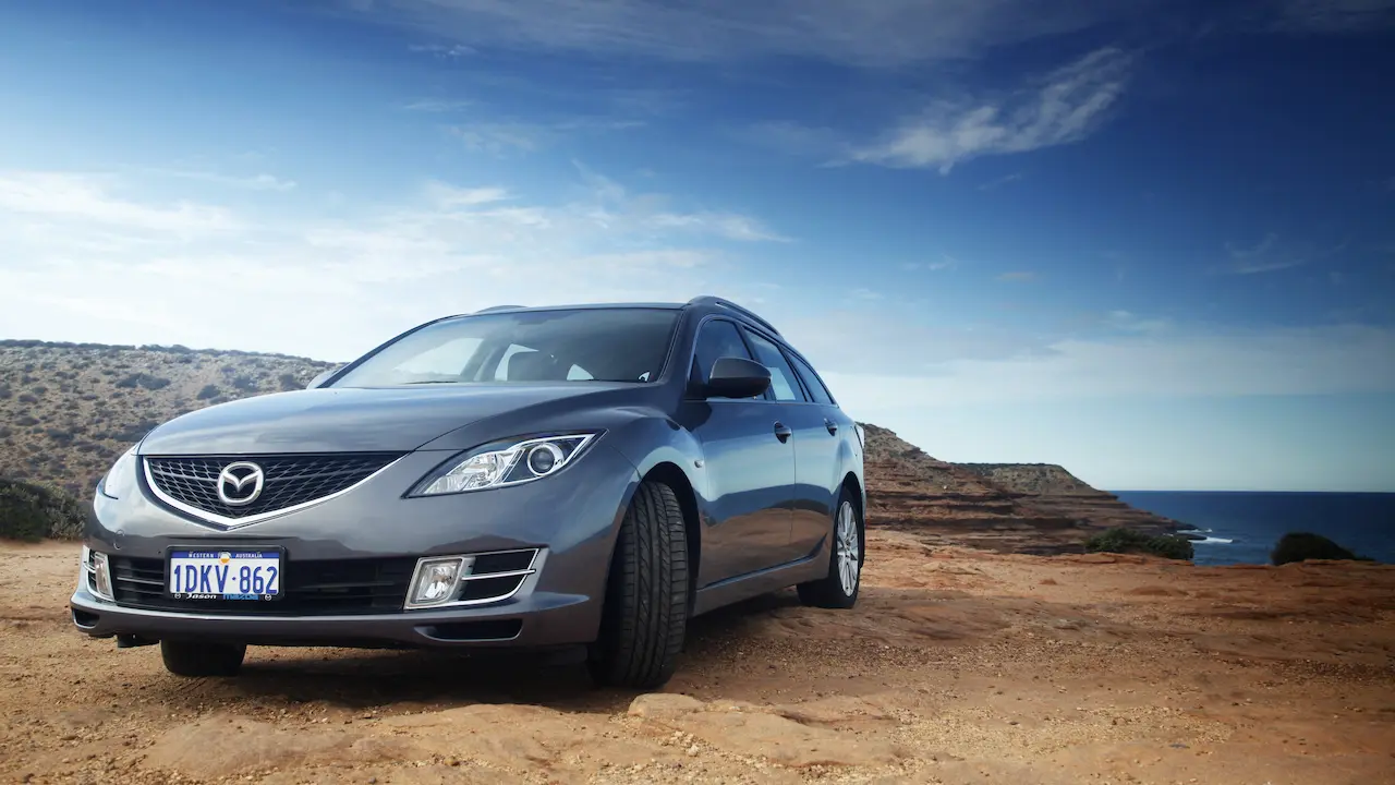
This no-fuss logo reflected a time of major growth. Mazda introduced hits like the RX-7, 323, and 626, and the bold wordmark was splashed across everything from brochures to buildings.
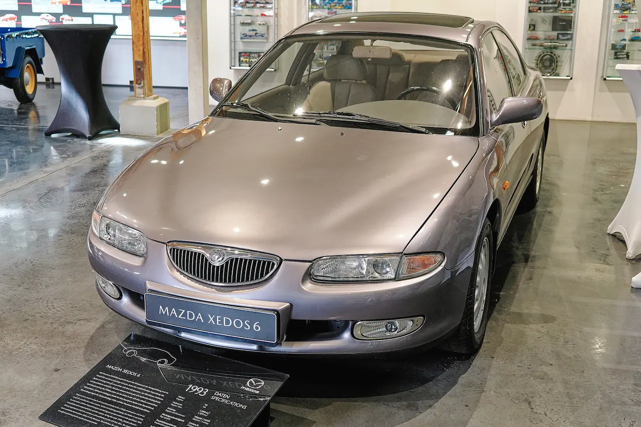
1991: A Touch of Elegance
In the early ‘90s, Mazda reintroduced a symbol-based logo: a diamond-shaped emblem set in a circle, designed to suggest wings and a rising sun. Unfortunately, it looked a bit too much like Renault’s badge, so a year later, Mazda softened the design into a rounded “M” with wings inside an oval.
This version appeared on the nose of the MX-5 Miata, quickly becoming a favourite with fans.
1997: The Birth of the Modern Badge
A pivotal year in Mazda’s visual history, 1997 saw the debut of the current winged “M” logo. The badge was designed to reflect growth and continuous improvement, with the stylised “M” forming a pair of wings representing flight, freedom and creativity.
The brand name was also given a refresh: the same blocky typeface from the 1970s turned a confident blue, now Mazda’s official corporate colour.
2015: Polished and Premium
As Mazda pushed into more premium territory, so too did its badge. In 2015, the brand introduced a silver version of the logo, often edged in blue for digital and print branding. This deeper, more metallic design aligns with Mazda’s upmarket push and appears on everything from dealership signage to global advertising campaigns.
2021: Looking Back to Leap Forward
Celebrating 100 years of innovation, Mazda released 100th Anniversary Edition versions of the Mazda3, CX-30 and MX-5 in 2021. These special models featured a commemorative badge that cleverly merged the original Toyo Kogyo logo with the modern Mazda wings, a nod to the brand’s enduring legacy and forward-thinking spirit.
A Badge with Global Recognition
Today, the Mazda logo is instantly recognised around the world. Whether it’s on the grille of a family-friendly CX-5 or the sleek body of an electric MX-30, the badge symbolises more than just the brand, it represents a century of daring ideas, engineering milestones and a unique Japanese approach to design and driving pleasure.
Mazda’s visual identity has come a long way, but its heart remains in Hiroshima, where it all began with a cork and a dream.